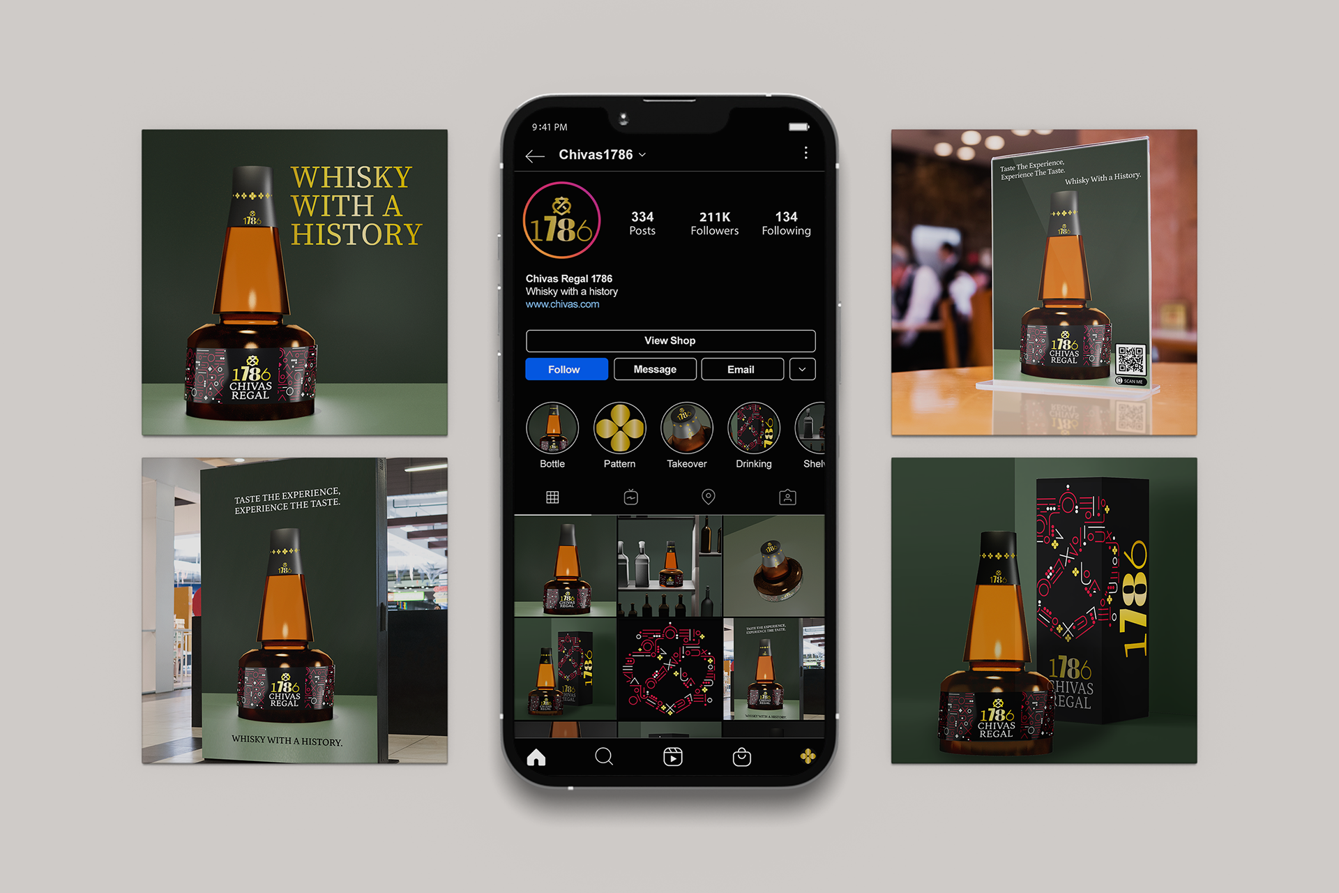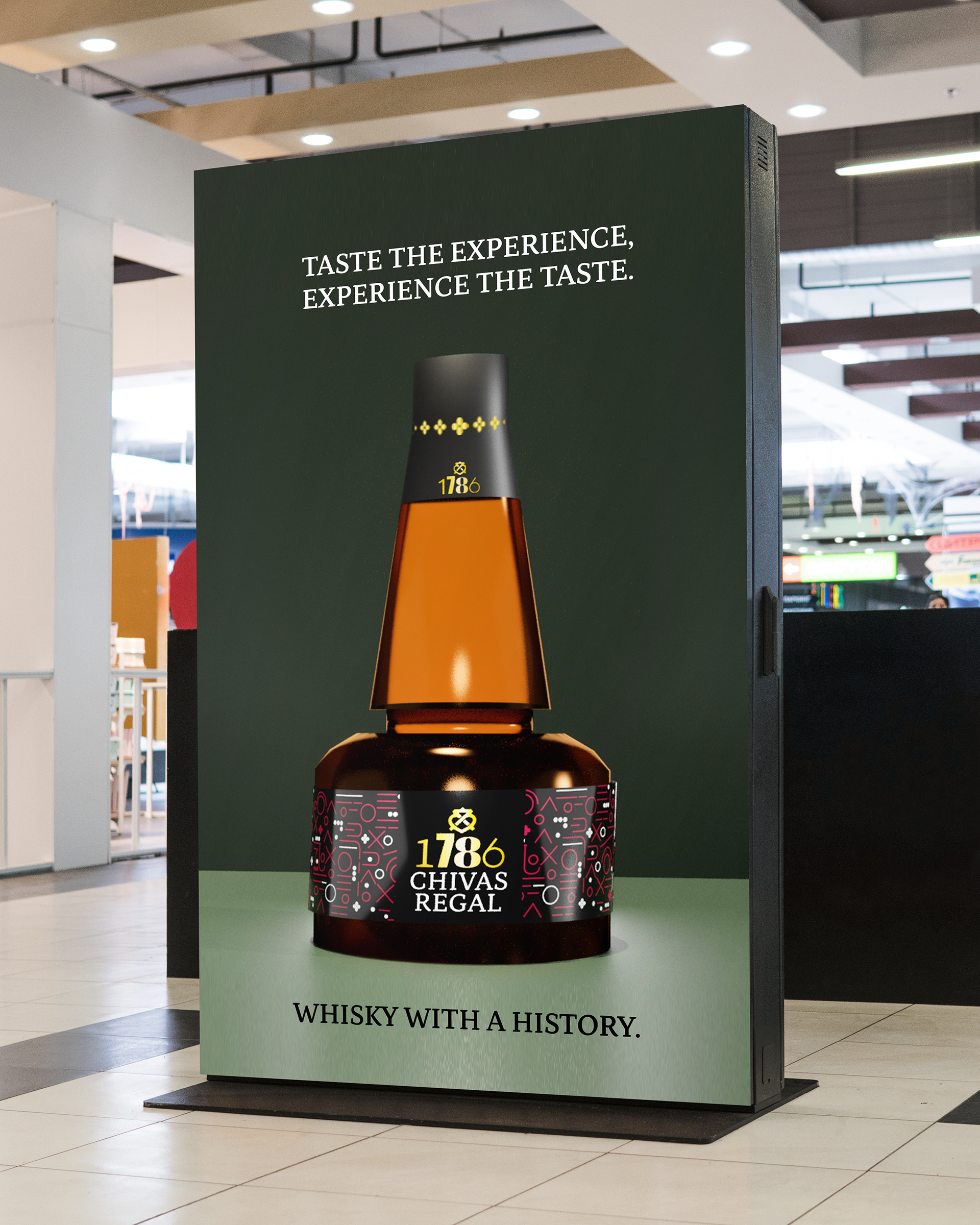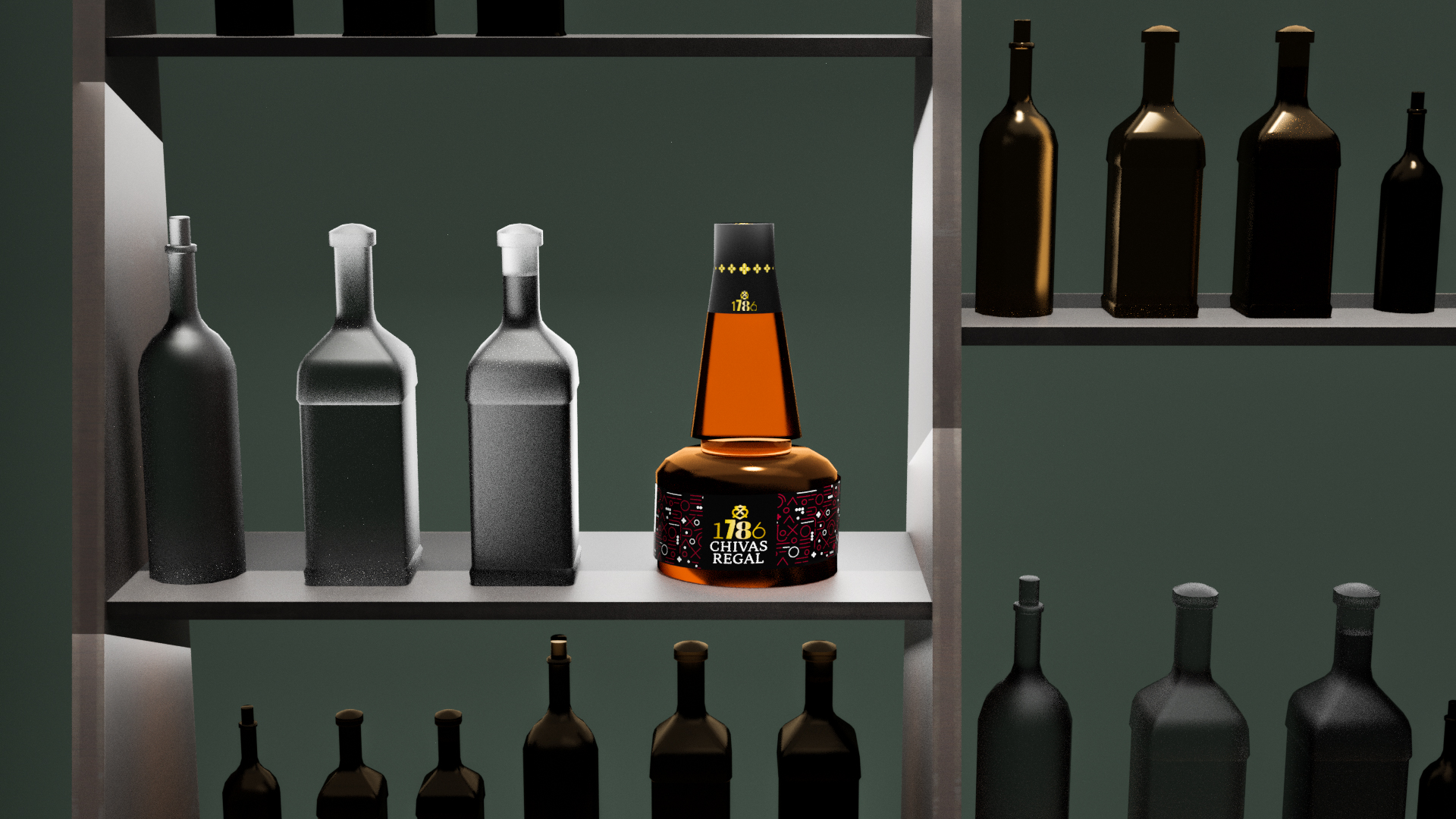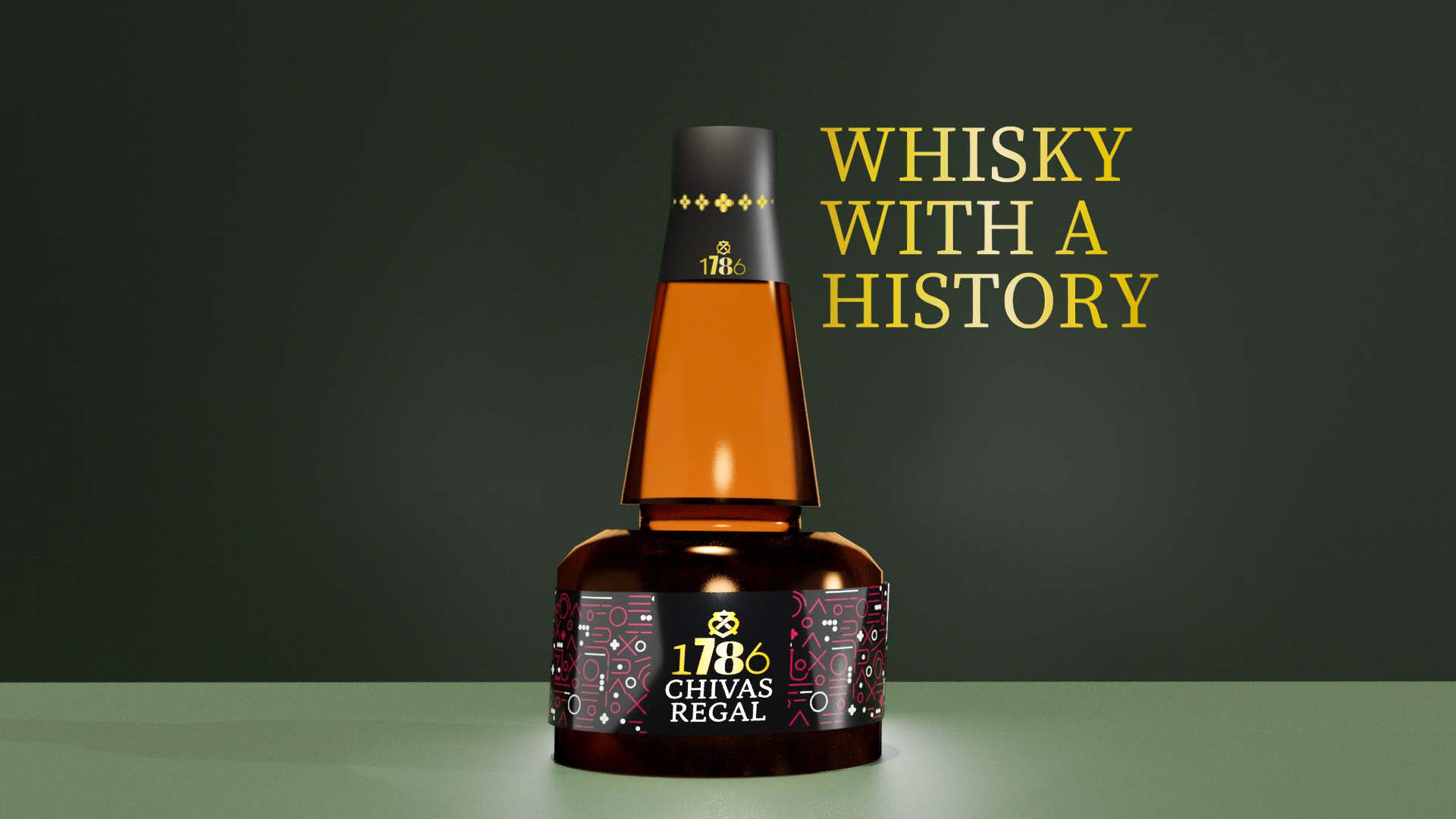
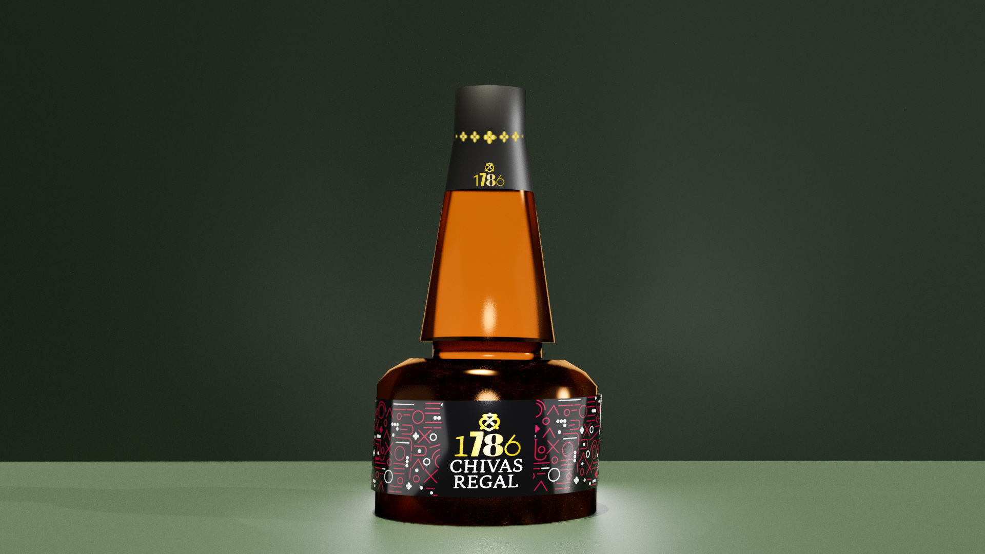
My aim with this rebrand was to build on the rich brand history while introducing a modern twist.
The bottle shape is inspired by the copper stills found in the Chivas Regal Strathisla distillery in Speyside. The copper colour is mirrored in the golden whisky held in the bottles.
The packaging design is inspired by design elements and motifs taken from Scottish newspapers published at the time of the distillery's founding. I used a different font for each digit to reinforce the varied customer base. The colours provide continuity from the established branding and maintain the luxury feel.